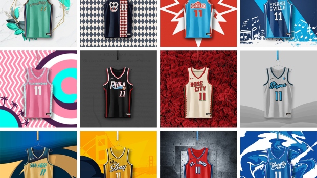
As the WNBA’s historic 25th season kicks off tomorrow evening with the 2021 WNBA Draft, people are absolutely buzzing for the season to begin!
While the WNBA has seen ample growth in previous years, gaining well-deserved recognition, this past year seems almost magical for not only the women’s game but for women’s sports as a whole.
People are buying and are demanding more of the WNBA product! So much so that various Twitter user ryaninsix along with other graphic designers came together to collaborate on the possibility of 12 WNBA expansion teams.
League commissioner Cathy Englebert spoke just yesterday on how an expansion is definitely in the works, but isn’t a possibility within the foreseeable future. But we’re not buying it.
We need more teams, especially one north of the border!
So thankfully for the graphics team involved because we are now begging Englebert and the rest of the WNBA to PLEASE reconsider building on that expansion project sooner than later.
The Charlotte Rush
Mint City is an absolute understatement because these jerseys are FRESH. With the mint green, the mint leafs, we’re loving the play on words homage to the city’s long history of money and being home to the country's first mint branch.
The Cincinnati Majesty
If the team’s brand is building off of the Cincinnati Royals (now, Sacramento Kings) then boy did they nail it. The use of the Royal’s blue and red and turning the Majesty into a more crimson red and dark rich navy blue, along with the restructuring of their original logo and giving it the royal treatment is a thing of beauty.
The Denver Gold
We’re absolutely loving the relationship between the Denver Gold and Nuggets. As the branding seems pretty familiar to it’s NBA counterpart, it still stands out and gives a unique twist to the popular branding.
The Nashville Notes
This concept has to be one of our favourites. Tying into Music City’s deep roots has us saving up money in hopes that this expansion happens in the near future so we can purchase a jersey. From using a guitar pick and string into the logo to using music notes as lettering, on top of tying in the three stars representing the state’s Grand Divisions. We simply need this jersey concept NOW.
The Orlando Flamingos
They really hit us with the back-to-back banger with this jersey. Again, we are saving up all of our coins in hopes this concept becomes reality. It’s about time a professional sports team has pink branding and we just know we’d be wearing the team’s jersey’s all of the time, especially on vacation.
The Philadelphia Bells
Paying homage to the Philadelphia Liberty Bell, we’re honestly just falling in love with the concepts at this rate. We love how the team incorporates from both the 76ers, especially with their Rebel Edition jersey mock-up, as well as the Phillies with their similar logo and colour match-up. But the use of turning a basketball and what appears to be an upside-down hoop into a bell? Sheesh!
The Portland Roses
Branding the team off of what the city of Portland, Oregon is known for is a huge win in our books, especially when their logo has a BASKETBALL AS THE BUD OF THE ROSE. The brains going into this team’s brand concept have our minds blown. They managed to turn a basketball team have legit rockstar apparel.
Sidenote: we’re going to be broke by the time we buy all of these jerseys.
The Salt Lake City Slopes
We need to emphasize we love the team’s logos more than what may be even humanly imaginable. The use of triangles to nod at ski trail symbols along with turning the curves of the basketball to make the city’s abbreviation of SLC is fueling our creative minds. This may even be our favourite logo lock-up of the entire collection.
The San Diego Waves
These jerseys truly are gifts that just keep on giving. Pointing towards the city’s tropical beach vibes, we’re absolutely reaching for the team’s Explorer jersey for when we’re on vacation. We’re getting some serious Flint Tropics vibes and we’re ALL here for it.
The San Francisco Seals
Similar to the Denver Golds concept, we love how the Seals are giving a nod to their city’s NBA team. Though of course not the exact same blue and yellow, we still are able to feel the Bay Area’s marine vibes and aquatic animal life through the use of the Seal. And what makes this even better?
The homage to the California Golden Seals of the WHL! Like are you KIDDING! The logo and jersey mashup may be one of the best in sports history in our humble opinions so we’re loving the team’s Explorer edition jersey.
The Saint Louis Spirit
Though the team’s name derives from the Spirits of St. Louis of the American Basketball Association, there may be nothing we love more than tying together sports logos to city history. Nodding towards American Aviator Charles Linberg, the team name derives from the name of the plane Linberg used to become the first pilot to successfully fly across the Atlantic Ocean via airplane. As the team’s logo incorporates a retro plane, as well as the city’s famous Gateway Arch and mending it into a basketball, this concept is definitely a winner.
The Toronto Huskies
This concept is a big win for us Canadians. Throwing it back to Toronto’s deep basketball roots, the concept definitely helps our “what if” minds following the folding of Toronto’s first NBA team.
We’re absolutely loving the Canadian vibes we’re getting from this concept. The incorporation of a basketball as mountains within the first logo to putting toques on both a husky and basketball, we’re loving the vibes of this concept with the play on the team’s previous branding.
And there you have it! We’re honestly tossed up on which jersey is our favourite of the group, but like we’ve said we’re saving our money in hopes a possible expansion does happen and the league picks up one of these concepts.
Until then, we’re counting down the days until the league’s season opener on May 14th and make sure to show some love for the creators behind these concepts!


