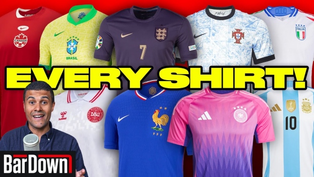
The Summer of Soccer is officially upon us as the 24 competing nations at UEFA Euro 2024 have either played their first match, or will be playing it in the coming days. On top of that, the 2024 Copa America tournament will also be kicking off when Canada meets Argentina on Thursday.
The anticipation is over, the excitement is realized, and the sweet release of international soccer is being felt throughout different parts of the world.
While expectation for some squads is higher than others, one element of these tournaments competes on a level plane -- how does everyone look?
Some teams are undoubtedly reverting to their tried-and-true classic looks, while other teams have gotten a little more experimental with their modernization. To break down all the looks -- from both Euros and Copa America -- our own DZ dives in.
One of the coolest design elements comes out of the Denmark kit, in which the shirt is secretly lined with 1,535 club names; all of which are associated with the Danish football association. Paying homage to the grassroots programs that culminate in a chance to represent nationally is an awesome nod from the world's biggest stage.
Another unique design element is present on the French away shirts from Nike, as the pinstripe look is a clear-as-day nod to the past, while the blue-to-white-to-red gradient of the pin stripes adds a modern twist to the design.
Moving onto the Copa America shirts, a wide array of inspiration went into the various designs. This includes the contours and land formations of Brazil, the art styles of Mexico, and... perhaps... a nod to hockey on the Canadian shirts?
Which shirts are your favourites? Which do you not care much for? Let us know in the YouTube comments!


