When Colorado Avalanche forward Nazem Kadri (still feels weird to type) tweeted that he was all for his new team donning the Quebec Nordiques signature powder blue sweaters a while back, he not only spoke for himself, but for the thousands of hockey fans who have thought this for years now.
Adidas reintroduced alternate jerseys to the NHL for the 2018-19 season, and a number of squads decided to go the retro route, including the Coyotes, the Devils and of course the Hurricanes, who somewhat controversially repped the Whalers classic green sweaters.
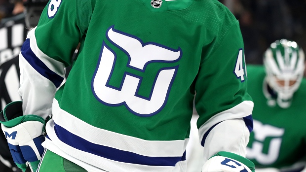
What did we learn from the alternate jersey launch? Well, aside from the fact that some fans in Hartford really don't ever want to see their jerseys on those "bunch of jerks" again, we also learned that hockey fan appetite for retro looks is insatiable. That's why we've thought of seven designs from the past that we think need to be on the alternate jersey menu for fans in the 2019-2020 season.
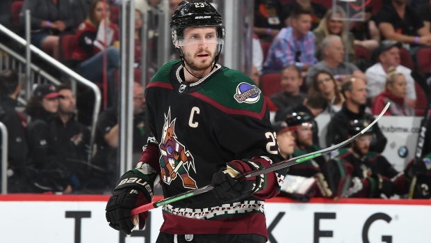
New York Rangers - Lady Liberty (Circa 2007)
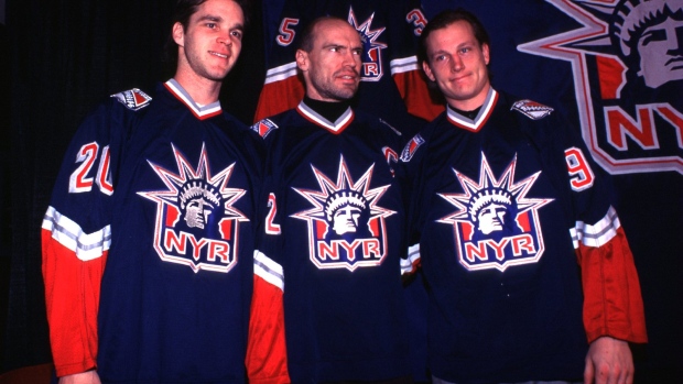
When the NHL handed their jersey supplier contract to Reebok, the Rangers' Lady Liberty design was left in the past. Considering the fact that the Rangers have played in three outdoor games since 2007, it's a bit surprising that the design never remerged to be used during either the Winter Classic or Stadium Series. But with a reinvigorated interest in the Rangers in the Big Apple due to free agent signing Artemi Panarin and draft darling Kappo Kakko, what better time to reintroudce Lady Liberty to boost jersey sales even further?
Pittsburgh Penguins - Diagonal City Font (Circa 1997)
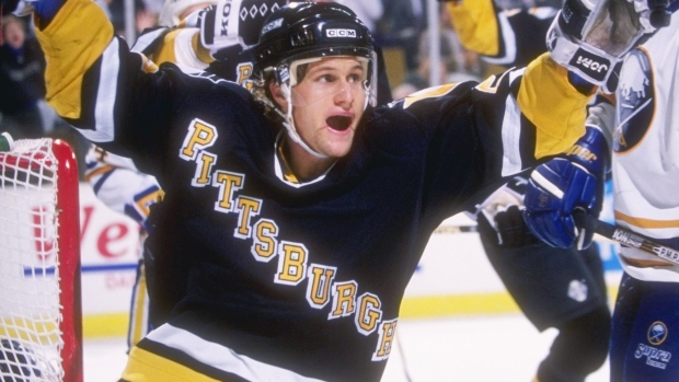
Three people lifted this Pittsburgh diagonal-font jersey into the popular culture stratosphere. Mario Lemieux, Jaromir Jagr and Snoop Dogg. It may be too late to get Phil Kessel in this jersey, but something tells us Penguins fans would be perfectly fine with settling for a Sidney Crosby version of this jersey. Diagonal font is no longer en vogue, but if we're resurrecting everything from the 1990's, why not this design?
Boston Bruins - Little Bear (Circa 2006)

Okay, so maybe not everyone in Boston loved this design that made their logo resemble the Sugar Crisps bear. But we don't think that rival fans would mind seeing Boston return to their Little Bear. Jokes aside, we actually do really like this alternate. Nothing screams 90's retro quite like a gigantic logo placed across the centre of a jersey design. Again, if Fila can make a comeback because it came from the 90's, Little Bear stands a chance, too.
Atlanta Thrasher - OG Bear (Circa 2006)

This pick is a little controversial since the team didn't switch their zip code for a postal code all that long ago. And it also lets you know that Jesse Pollock didn't write this post. Yes, the Thrashers are now a defunct team because fans in Atlanta didn't offer a ton of support to their struggling team. But if the people who brought the Thrashers to Atlanta did anything right, it was designing these jerseys. Of course, they then proceeded to create terrible design after design following the originals, but hey, lets celebrate what was actually cool about the Thrashers!
Calgary Flames - Blasty (Circa 2006)
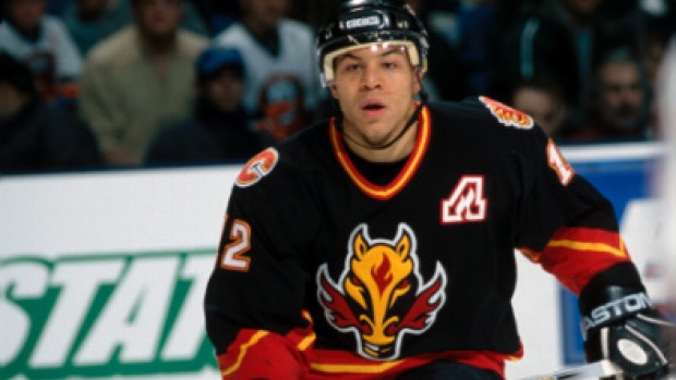
For those of you who watched the BarDown Jersey Quiz, you know that "Blasty" holds a special place in our hearts. The Flames brought back their original jersey design to use as an alternate, and while we love it, we also love Blasty. Perhaps the Flames should make the retro look from the 80's their permanent home and away jerseys and bring Blasty out of the barn as their alternates? Just a thought.
Edmonton Oilers - Todd McFarlane's Alternates (Circa 2007)
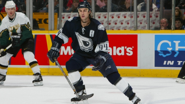
In our opinion...when famed comic book creator Todd McFarlane designs a jersey for you, you ought to continue using it until the end of time. Oilers fans seem to be split on their Orange Tang coloured uniforms, so why not throw it back to a design that won't require the use of sunglasses to look at it? Alright, that may have been a little harsh on the Oilers' new look, but tell us that you don't agree a McDavid version of the McFarlane jersey wouldn't fly off shelves?
Los Angeles Kings - Purple & Gold (Circa 2007)

After we listed all of those cartoon logo designs from the 90's, we bet you thought that we would be listing the Los Angeles Kings Burger King uniforms, didn't you? Well, no, we think those still don't look all that great. Especially in comparison to their purple and gold jerseys from the 70's and 80's. The Kings have rocked Lakers-inspired design during warm-ups before, and while those didn't exactly work, we think that their original design could. Not to mention, why not lean into the resurrection of the Lakers and give fans in Los Angeles something else to purchase that's slathered in purple and gold?
