There are some NHL jerseys that need to just stay hidden and out of sight for the rest of time.
Listen, we’re all for teams shaking things up a bit. But then a jersey comes out that just makes us scratch our heads. Really? That’s what you went with?! It’s the middle of summer and we’re in a reflecting kind of mood, so here are five jerseys that we think you’ll agree should never, EVER make a comeback to the NHL.
The following list is in no particular order.
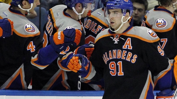
NEW YORK ISLANDERS 2011-14 THIRDS
What on earth was the thought process behind this one? Looks more like a jersey you’d see in an inline game than actual NHL contest. The Islanders’ new black thirds are pretty sweet, but this one caught the eye for all the wrong reasons.
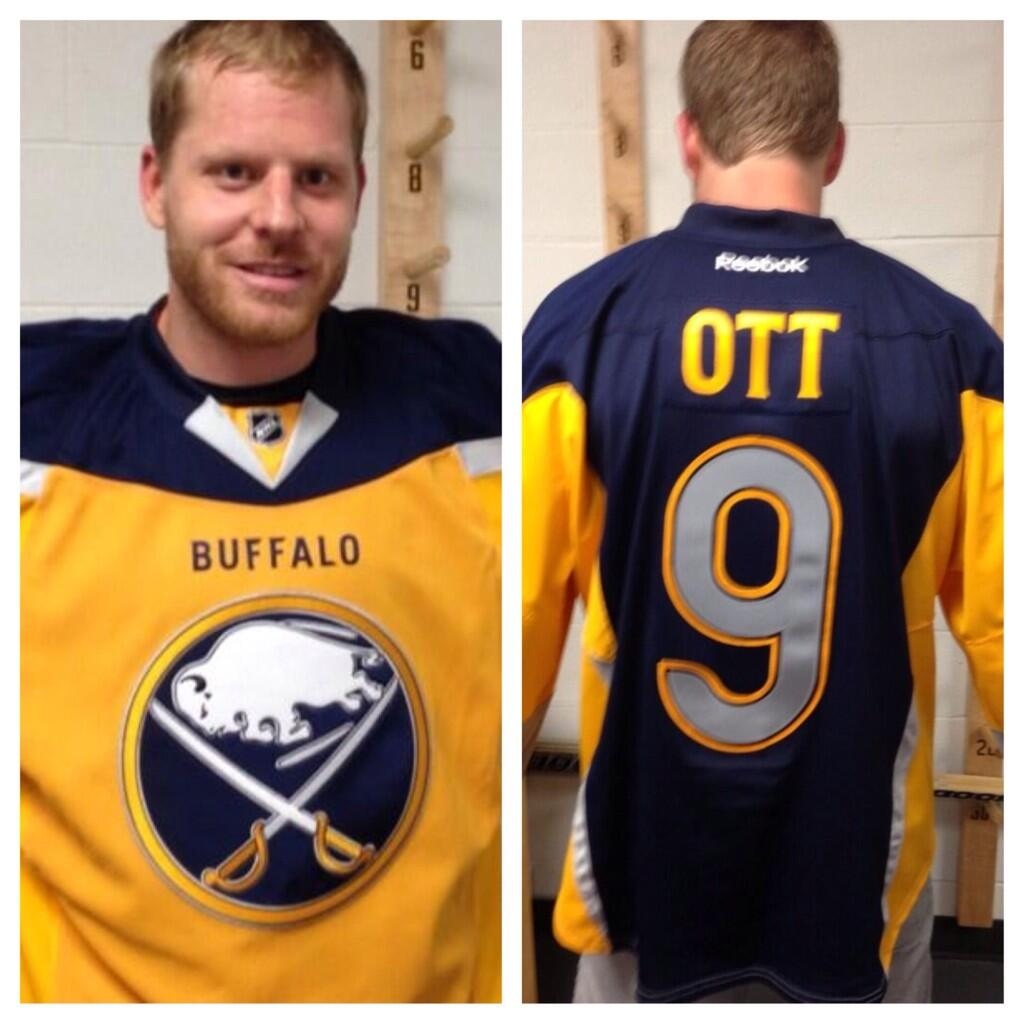
BUFFALO SABRES 2013-14 THIRDS
Goodness gracious. Not only does the front look like a practice jersey, but the back is a different colour. Why are you essentially wearing two different jerseys for crying out loud?!?! In a game?!?! We’ve seen some fire jerseys from the Sabres in the past but this was not one of them.
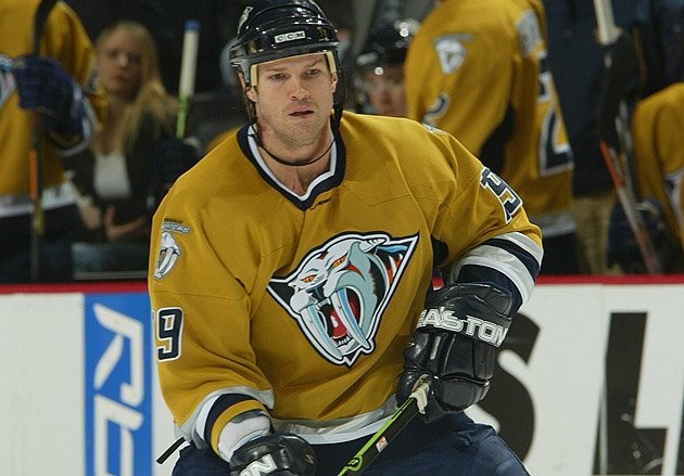
NASHVILLE PREDATORS 2001-07 THIRDS
The logo on this one is okay but the colours… the colours! Oy! Mustard belongs on hot dogs, not jerseys. Oh what could have been with some different colours!
DALLAS STARS 2003-06 THIRDS
Honestly, props to the Stars for attempting to get creative with this one. The only problem? It didn’t turn out so well. Per Sports Illustrated, the Stars said “the new logo depicts a constellation of individual stars aligning to form an unstoppable force of nature, a charging bull.”
Sure…
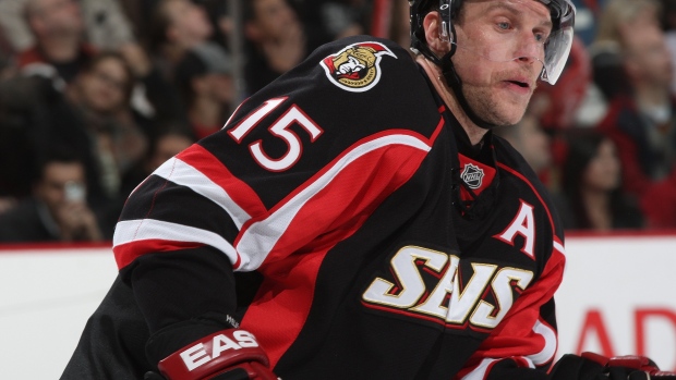
OTTAWA SENATORS 2009-11 THIRDS
There is literally nothing appealing about this jersey. Keep the logo, drop the letters. End of story.
So hockey fans… Which jersey is the worst in NHL history?
