The Buffalo Sabres decided to switch back to their blue and yellow colour scheme in 2006 after rolling with black and red for 10 years, and it looks like the classic jersey from their Stanley Cup run might be making a return next season.
According to Viktor Maudr, the leader of the Czech and Slovakia Sabres fan club, the team is reportedly bringing back the black and red jerseys next season.
Will it just be as an alternate jersey? Will it be their full-time threads? We’re not sure about that just yet, but we do know it’s a jersey that never should have left and needs to come back as soon as possible.
In the past few years we’ve seen the Arizona Coyotes bring back their Kachina jerseys and the Ottawa Senators return to their classic look, and we’re really hoping other teams start to follow this trend and bring back some specific throwback jerseys as their full-time threads.
Here are a few jerseys we’d love to see make a comeback to the NHL in the near future.
ANAHEIM DUCKS (1993-2006)
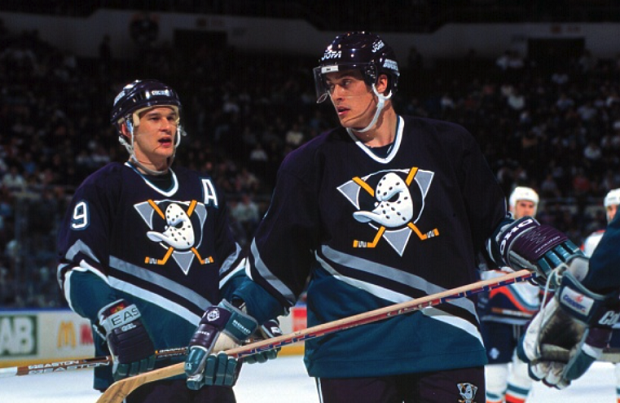
The Anaheim Ducks have worn the throwbacks during warm-ups and during their 20th anniversary season, and we’ve even seen them bring back more modern versions of this look in recent years, but they just don’t compare to the original.
When Anaheim dropped “Mighty” from their name and rebranded to the “Anaheim Ducks” there weren’t very many people happy with the jersey rebranding that came with it. Not much has changed with it over the years, but they have been finding ways to use their original look when possible. However, this is a look that we feel they need to bring back as their full-time threads because they're some of the greatest jerseys of all-time.
DALLAS STARS (1997, 1999-2006)
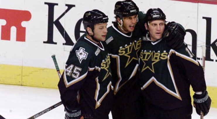
Just about every single Dallas Stars fan will tell you that they prefer the original look and the look from the Stanley Cup run over their current look and the one they had in between now and then, and we totally agree.
The Dallas Stars introduced the green version of this jersey as an alternate jersey in 1997 and it didn’t take very long to become the team’s go-to look. The Stars rolled with the look as their full-time threads from 1999 to 2007, and even kept the logo for their white jerseys when they rebranded in 2007-08, but by 2011 the original logo was eliminated from their game day look.
FLORIDA PANTHERS (1993-2007)

The Florida Panthers slowly updated their original jersey and logo over the years, but by 2009 you knew there was a chance it would be played out eventually when they introduced their alternate jersey with an entirely new logo.
By 2016-17 the Panthers abandoned their original look and completely rebranded their jersey and logos. They did every fan a favour, however, by bringing back their original logo for their Reverse Retro jersey, but they’re another team that should really consider incorporating the original jersey and logo as an alternate at the very least.
LOS ANGELES KINGS (1988-1998)

The Los Angeles Kings’ look from 1989-1998 wasn’t just a hit in the hockey world, but it was a hit in pop culture as well, mainly because of the support they got from N.W.A. at the time.
It also helped that these were the jerseys they wore during the Wayne Gretzky era, as any team’s exposure will shoot up when they have The Great One on their roster. The LA Kings have worn multiple fan favourite jerseys over the years, from their gold and purple days to the black and silver days, but the jersey from this era is an all-around classic. They did us all a favour by bringing it back this year as an alternate, but it’s time to make them the full-time threads.
NEW YORK ISLANDERS (1995-1997)

We know these aren’t the nicest jerseys that the New York Islanders have won during their existence, and they were only part of the lineup from 1995-97, but the Fisherman jersey has to make a comeback.
Sure, not every fan is into the look of this jersey, and that’s including Isles fans, but this jersey wasn’t used long enough and needs to make a return as a full-time alternate or every day jersey.
SAN JOSE SHARKS (1991-1998)
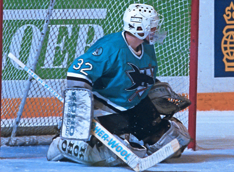
A bunch of teams made fans happy with their Reverse Retro design and the San Jose Sharks were one of those teams. They did a great job of turning two of their earlier looks and designs into one awesome, modern jersey.
The Sharks have never really worn a bad jersey during their existence, but the original jersey is a look they should consider bringing back on a full-time basis.
VANCOUVER CANUCKS (1985-1997)

The Vancouver Canucks went from blue, green and white to black, yellow and red, and then back to blue, green and white. We’re not saying there’s anything wrong with the Canucks’ current look - because there isn’t - but they need to do fans a favour and bring back the old school skate logo and the red, black and yellow colour scheme for more than just an anniversary celebration.
WASHINGTON CAPITALS (1995-2007)
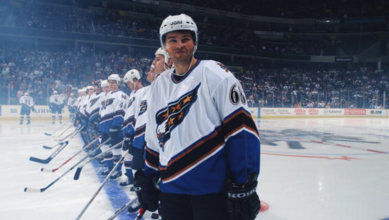
The Washington Capitals made everyone happy by bringing back their Screaming Eagle logo for their Reverse Retro jersey. It was one of the sharpest looking logos back then and it still looks awesome today.
The red version of the jersey for the Reverse Retro threads was awesome, but if they brought back the original version or at least used the Reverse Retro jersey as their everyday jerseys they would be an absolute hit.
WINNIPEG JETS (1979-1996)
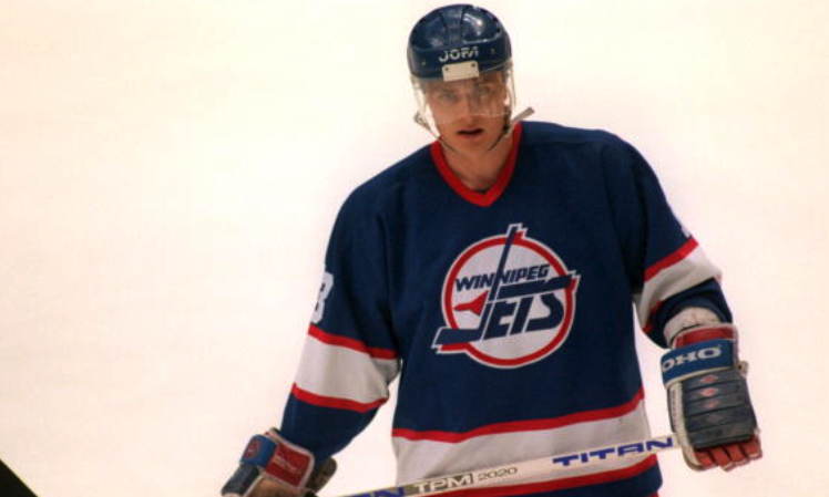
The Winnipeg Jets have brought back the original logo as an alternate, their Reverse Retro, and both of their Heritage Classic games, but most Jets and hockey fans as a whole would love to see the original logo become their everyday look, even if it technically was a different franchise.
Their current alternate jersey with the old school logo is one of the sharpest jerseys in the game right now, and if they made it their go-to look and added another version they’d look unreal every single night.
Let us know which throwback jerseys you’d like to see make a return as an alternate jersey or full-time look!

